This editorial layout was created as part of my graphic design course. Inspired by Tim Burton’s stop-motion film “Corpse Bride,” the project explores the intersection of typography and narrative.
The goal was to capture the poetic melancholy and visual drama of the film through composition, type rhythm, and atmospheric textures.
The result is a cinematic magazine spread that balances editorial clarity with emotional storytelling.
The goal was to capture the poetic melancholy and visual drama of the film through composition, type rhythm, and atmospheric textures.
The result is a cinematic magazine spread that balances editorial clarity with emotional storytelling.
Format: Editorial layout
Project type: Student work — Graphic Design Course
Focus: Typography, composition, storytelling
Tools: Adobe Illustrator, Photoshop
Project type: Student work — Graphic Design Course
Focus: Typography, composition, storytelling
Tools: Adobe Illustrator, Photoshop
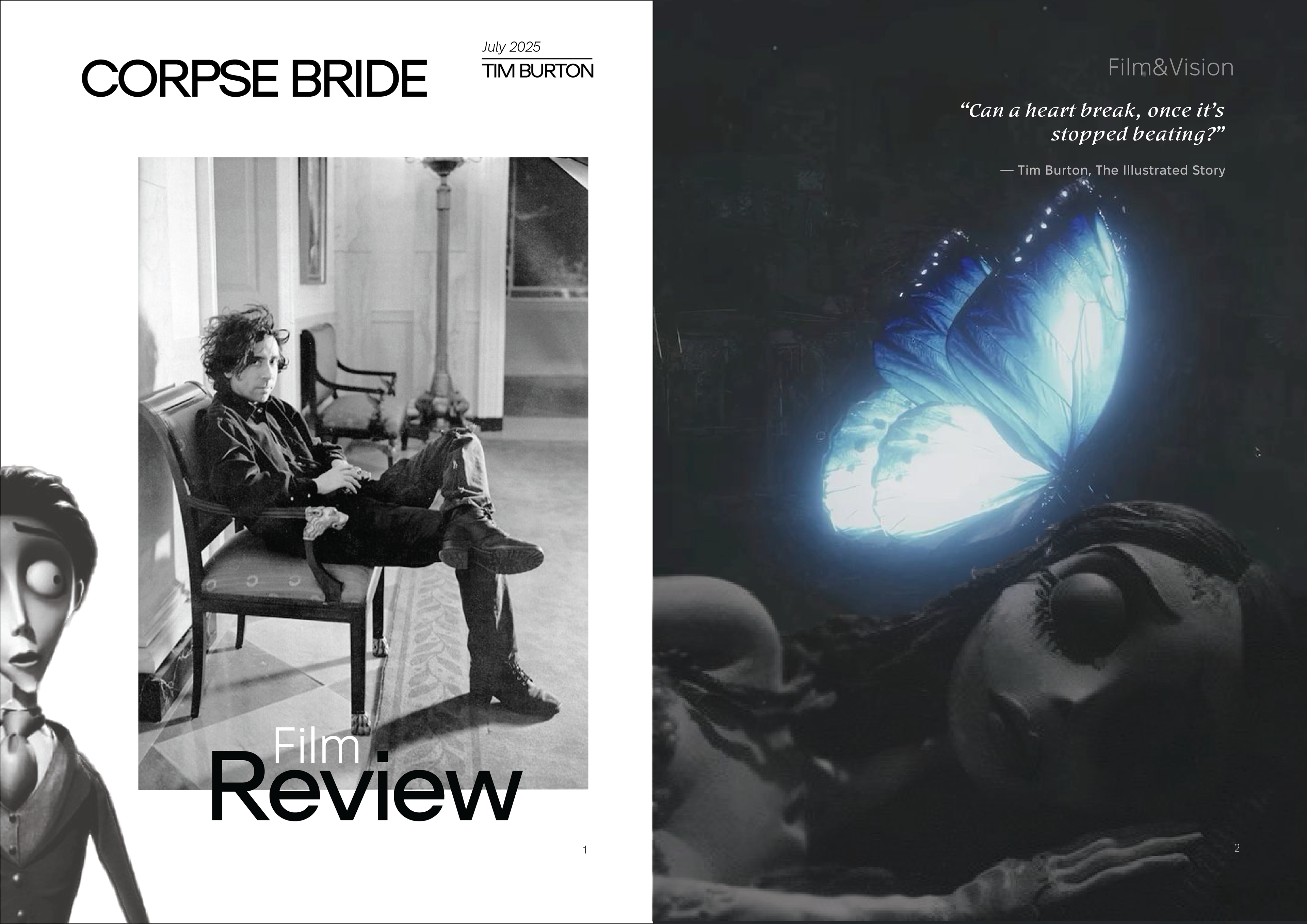
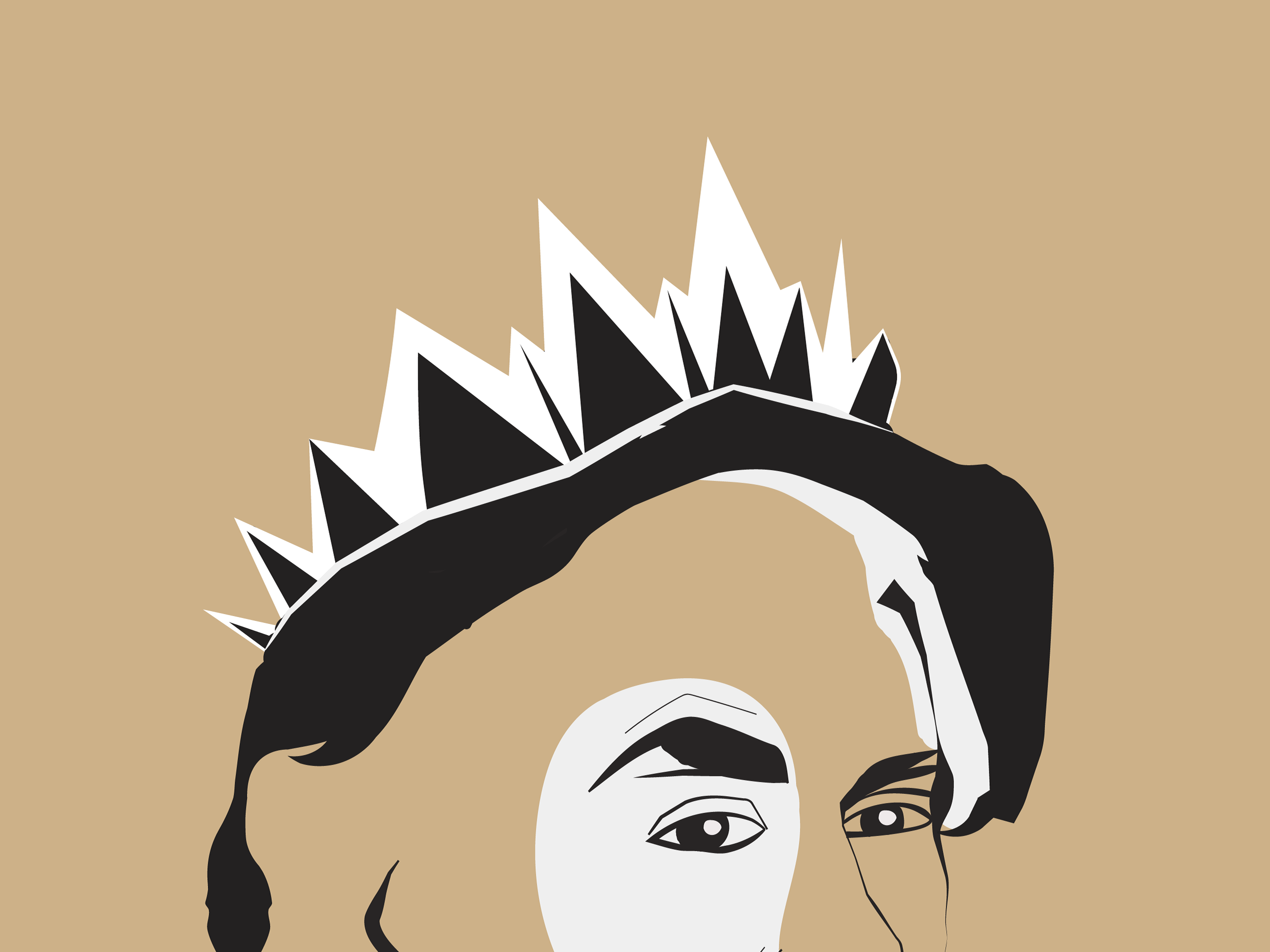
Cover design inspired by the elegance and eeriness of Burton’s cinematic world.
Minimal contrast, timeless serif type, and grayscale aesthetics set the tone for the article.
Minimal contrast, timeless serif type, and grayscale aesthetics set the tone for the article.
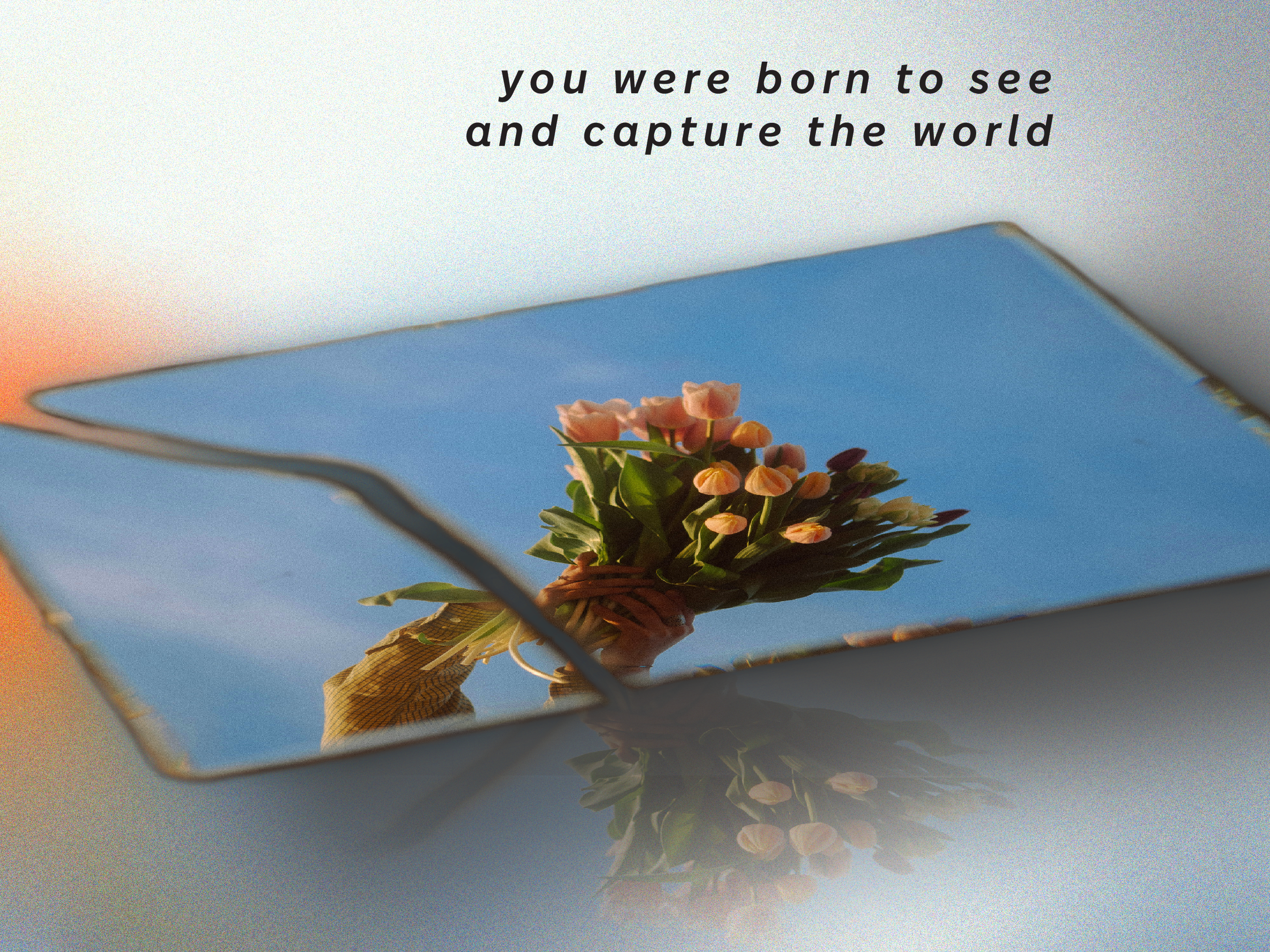
Opening spread evoking the fragility of life and death.
A glowing butterfly bridges the gap between animation and emotion.
A glowing butterfly bridges the gap between animation and emotion.
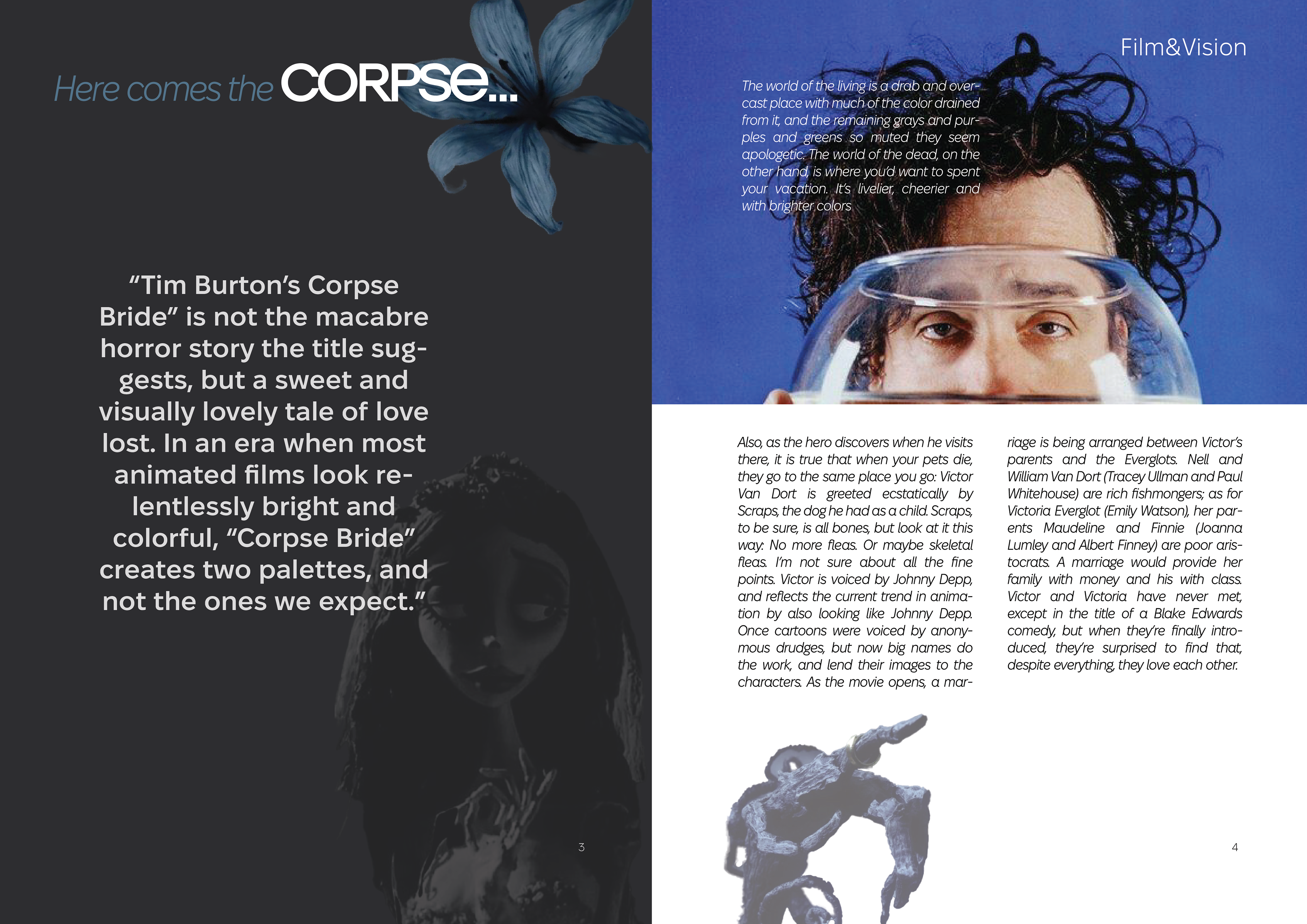
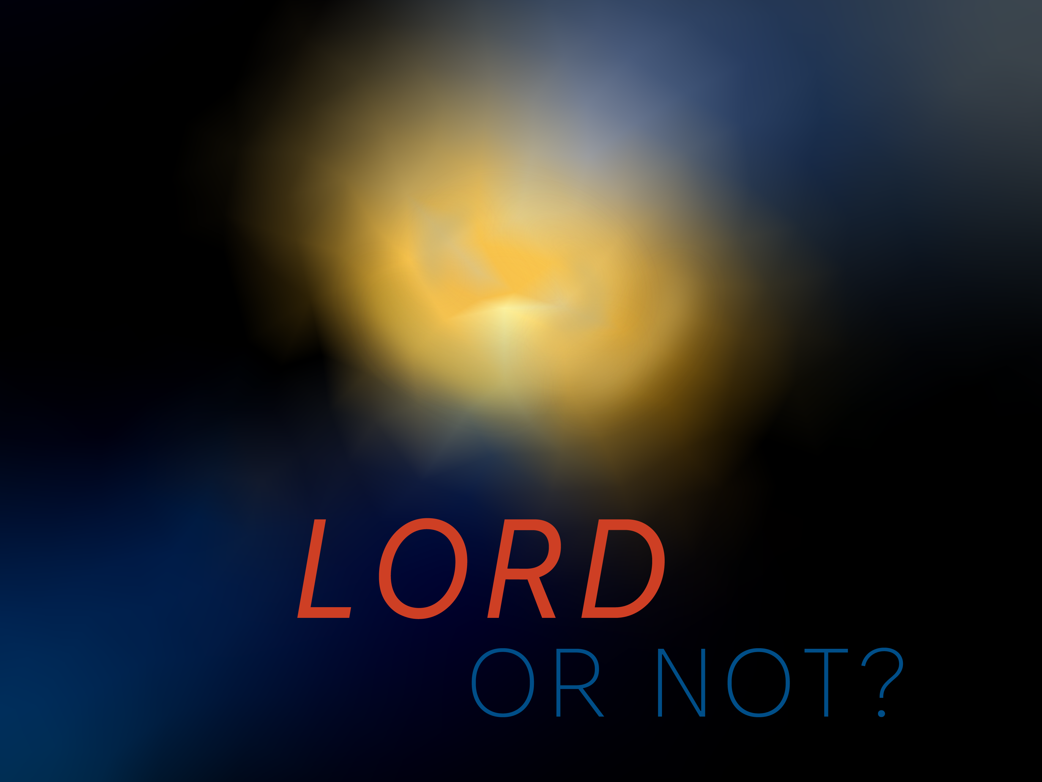
Exploring Burton’s signature style: surreal, melancholic, and poetic.
Dark layout, stylized highlights, and organic type rhythm emphasize the depth of his imagination. Typographic experimentation and color accent.
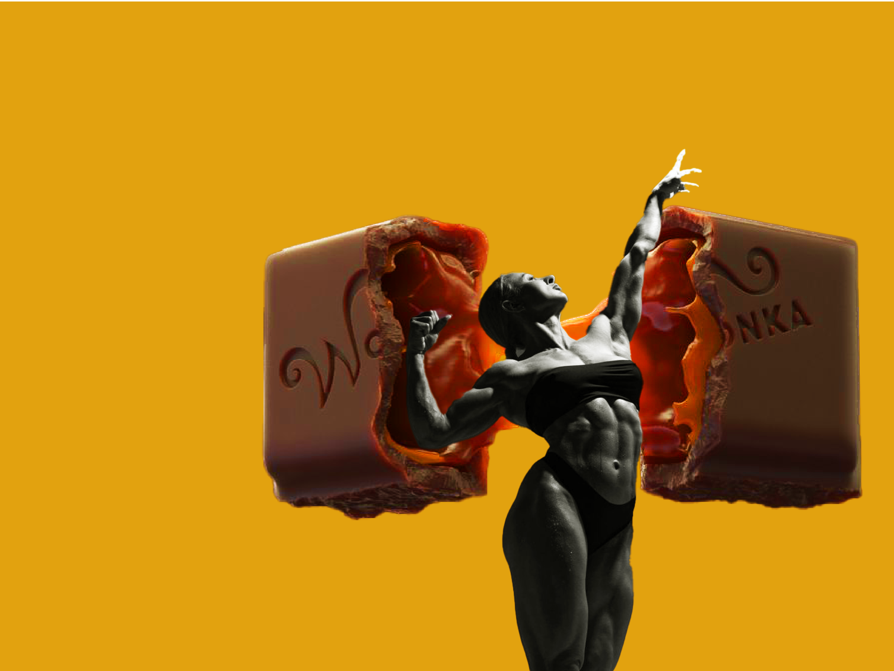
This spread reflects the absurdity and irony of Burton’s characters.
Dark layout, stylized highlights, and organic type rhythm emphasize the depth of his imagination. Typographic experimentation and color accent.
This spread reflects the absurdity and irony of Burton’s characters.
Editorial rhythm through hierarchy and contrast.
Balanced white space and column flow mirror the narrative pacing of the film.
Balanced white space and column flow mirror the narrative pacing of the film.
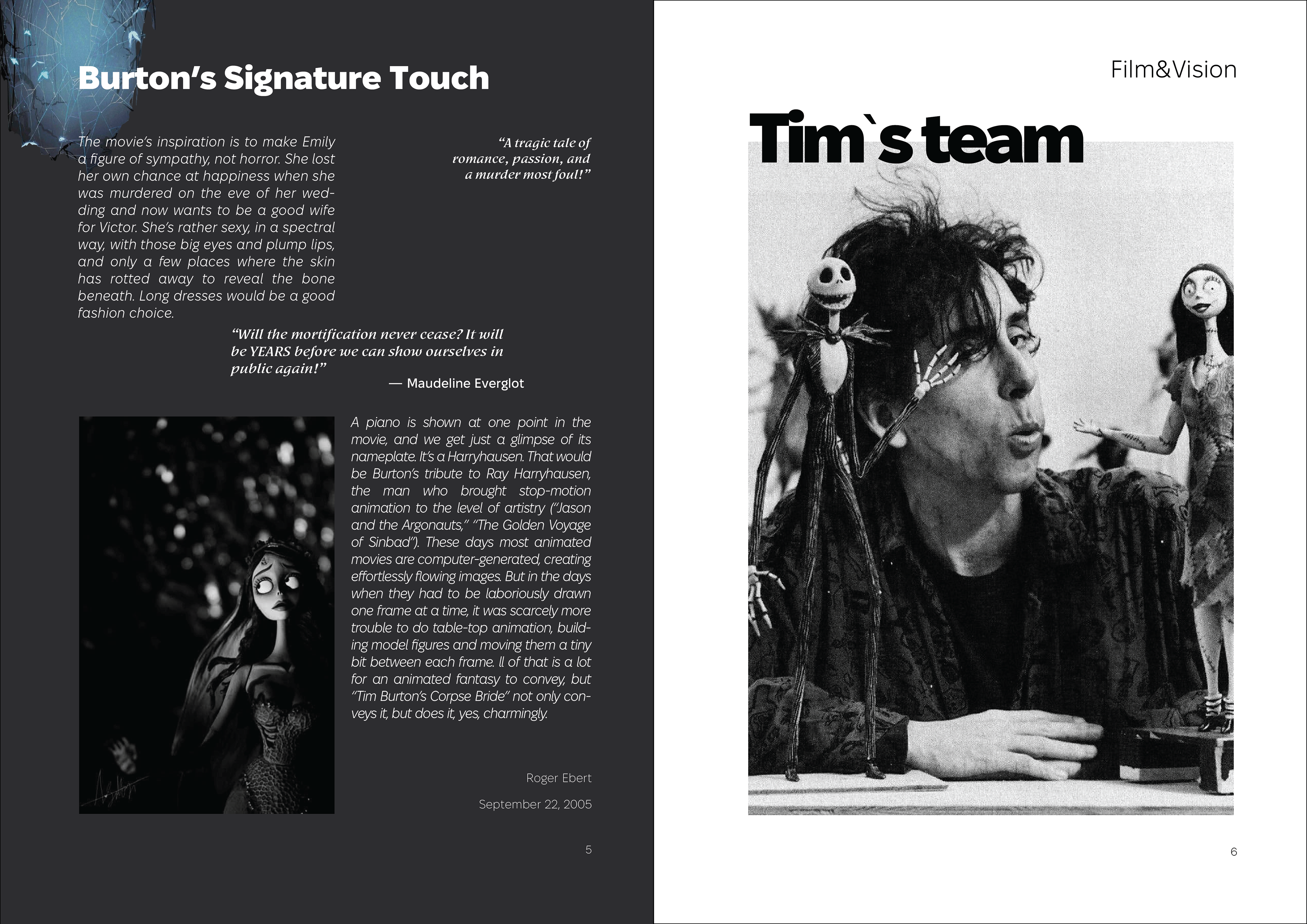
A tribute to Burton’s creative collaborators.
Candid visuals and open space honor the team behind the story.
Candid visuals and open space honor the team behind the story.
Thanks for watching — let’s create something together.